COLOURS FOR A UNIQUE INTERIOR

Colour is an important means of expression that can influence our moods and feelings. Each person has their own spectrum of preferred colours. Their influence on creating a pleasant atmosphere and on a person's physiological effects are extraordinary. We choose colours for interiors that we subconsciously associate with pleasant feelings or experiences. However, it is good to know the psychology and effects of colours when making the right choice. If you are not sure about choosing the right colours or combinations of colours, we have a description of some characteristics and some interior design tips for you.
Good tip: The choice of colour also depends on the light intensity of the room. We distinguish not only the amount of daylight or artificial light, but also the direction of direct or indirect radiation.
PSYCHOLOGY OF COLOURS
- active - more uplifting - for example, red and yellow
- passive - more soothing - for example, green and blue
- warm - they make the interior feel warmer and objects seemingly closer - an example is red and orange
- cold - they look impersonal in the interior and visually distance the objects - an example is blue and green
- neutral - they do not evoke any strong feelings and are most suitable for combination with other colours - examples are black, white and grey

COLOURS BY ROOM
When decorating the interior in colour, we take into account the specific use of the space. A typical example is the living room area, which is actively used by the family, so it is advisable to use warm and action colours. Conversely, in the bedroom, where one desires rest and peace, we choose colours that are cool and neutral. For today's simple and airy spaces in a house or apartment, a maximum of two primary colours and one complementary colour should be used. It is ideal to start with soft pastel colours in the living room and bedroom. The children's room should be brightened up with an intense colour, or colours that will cheer children up and encourage their creativity. Never go for a dominant red colour in the children's room as it is too aggressive.
Corridor and staircase
This space should create a suitable transition from the outdoor areas to the living areas and at the same time prepare for the overall atmosphere of the rooms. By contrasting colours we can draw attention to potential hazards such as stairs or thresholds which should be a darker shade. For the walls, on the other hand, we choose a paler colour that visually enlarges the space.
Bedroom
Be sure not to leave the bedroom all in white, it could look like a hospital room. Ideally, choose colours that give a sense of calm. Blue and green are particularly suitable. As a rule, blue causes a drop in blood pressure, calms the body and the spirit. Today's fashion trends also include brown, which offers a return to nature and represents comfort and cosiness. If there is a lot of brown or black, the bedroom looks sad or even gloomy, so it is worth combining the colours with white or light blue. For those who have trouble getting up in the morning, shades of yellow or orange are ideal, which also combine well with brown. If you want to invigorate your sex life with new energy, use the color red, but with caution, too much leads to aggression. If you also work in the bedroom, it's worth using green, which is both stimulating to the nervous system and calming. It could certainly appear in various accessories or flowering plants.
Kitchen and dining room
In the kitchen, we don't have to be afraid to use bolder colours such as fresh green, yellow, purple or red. All of these colours, applied in moderation, for example on just one wall, in combination with white, conjure up a cosy kitchen. Orange and yellow in the dining room stimulate our stomach, encourage communication and reflect pleasant light back into the room. Blue, on the other hand, dampens the appetite. Also, too sharp contrasts will not create a pleasant sitting area in our dining room.
Living room
Brown and orange are cosy and stable, complemented by green or blue to revive and stimulate the mind. Of course white goes with everything and is easy to combine with other colours. But think about other aspects too. Choose light shades for a small living room, a large room can also tolerate darker colours. If the room is very sunny and the sun beats down on your living room all day, don't paint it yellow or orange, but try using a light green, for example. Furniture and accessories tend to be the dominant elements in the living room. In a modern living room, you can afford a bolder colour, such as purple or grey, to go with a white sofa. However, you only need to apply it to one wall. Beige living room furniture stands out best on a white wall. Green and cream can also be used with flair, but you'd better choose accessories. For dark furniture, choose the lightest possible shades.
Children's room
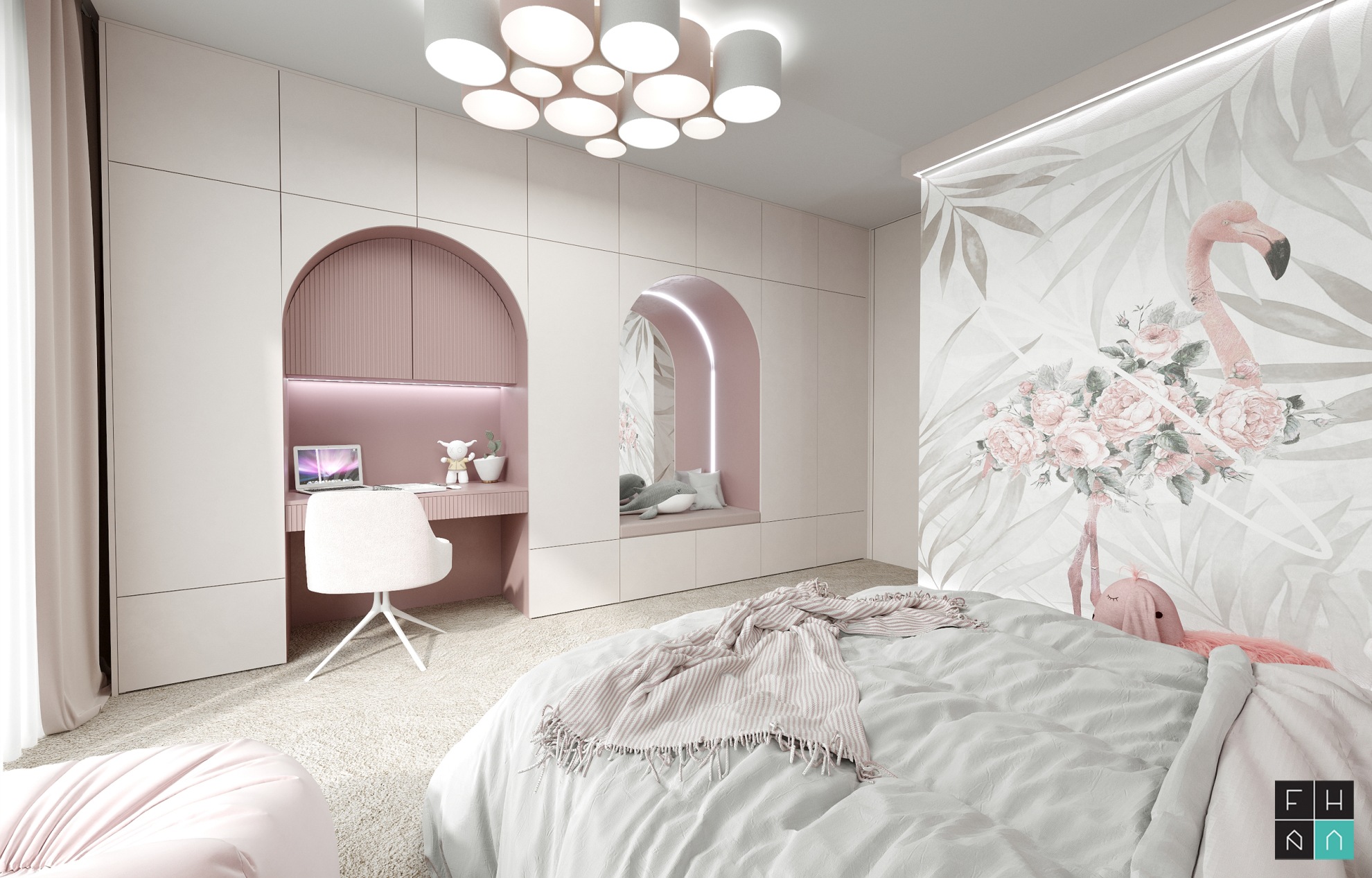
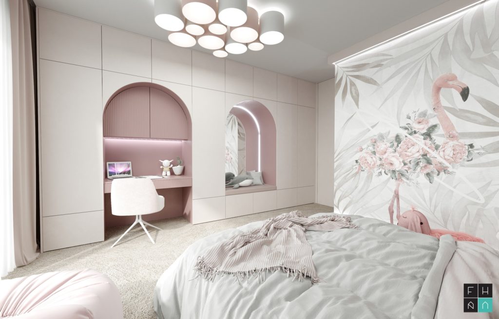
Here, a judicious choice of colours is very important, as it has to fulfil several tasks. To meet the spiritual needs of children, to dampen irritation while encouraging development, to foster creativity and the ability to learn. However, there are some colours to watch out for, especially if you have a hyperactive child at home. Red, yellow and orange are inappropriate for him; on the contrary, you should tone him down with colour in the room, so choose blue, green or light purple. Blue-orange is a balanced colour combination. Green tends to be suitable for children who like nature. You can't go wrong with white decorated with various colourful motifs. For large areas of walls and floors, choose light shades, while smaller areas (curtains, cushions, sheets) could be in richer colours. Correctly chosen nursery colours can suit a child's particular personality traits.
Workroom
Here, first of all, it depends on what demands the work puts on us, whether it requires concentration or, on the contrary, encouragement and stimulation. Cooler, matter-of-fact or neutral shades of colour help us to concentrate better, while more cheerful shades create an atmosphere conducive to creative activity. However, it is important to remember the right amount of colour used, which should be appropriately combined with neutrals such as white, grey or black.
How to visually change the space?
- small room - apply a light colour to the walls and ceiling and leave the floor dark
- high room - for both ceiling and floor, choose a darker shade than the surrounding walls
- low room - paint the back wall of the room with vertical stripes
- wide room - paint the side (long) walls and floor dark, leave the ceiling and back wall light
- narrow room - paint only one narrow wall in colour and choose a dark floor


